Design
Design near Zürich: brands, websites and interfaces that look like the business behind them.
- Built by: Orbit
Design near Zürich: brands, websites and interfaces that look like the business behind them.
Today a business is judged on screen first, long before anyone calls, and usually within a few seconds. Website builders and templates have made good design cheaper than ever, and that is exactly why so many web presences look alike: the same grids, the same images, the same sentences. A site that looks like the competition's says as little as one that is not there at all. Orbit designs brands and websites so that they look like the business: calm where the work is calm, loud where an event promises goosebumps, personal where a person is the brand. Everything is designed first in Figma, built from a design system shared by every page and every app of the client, and delivered the way it was designed.
• Brand concept, name and logo • Websites in several languages • Interfaces for apps and portals • Design systems from building blocks • Vehicle lettering and print • Wireframes and prototypes in Figma • Admin areas you update yourself • Built for the phone
A name from the Old Forest
Bombadille is the Public Impact Boutique of Jon Baumann in Langenthal, who handled dossiers on the staff of Federal Councillor Schneider-Ammann. In Switzerland, public affairs is a field of big firms with large teams in Bern and Zürich; Bombadille goes the other way, a boutique with a single face. The brand Orbit develops for it in March 2026 is inspired by Tom Bombadil, the character from Tolkien's "The Lord of the Rings" who belongs to no one in the Old Forest and helps everyone. Two of the three colours take their names from the same story, Goldberry and Willow, plus Peacock for the petrol, and the logo, a B in a ring, sits as confidently on the letterhead as on the stand at the Langenthal trade fair.
The landing page needs no menu to explain what is on offer. As you scroll, the first screen changes colour, from white to Peacock, Willow and Goldberry, and with each colour one of the three fields appears with a sentence in two parts, the first of which always belongs to the client: "Your concerns are heard and understood. We translate and convince." Then Jon Baumann steps into the picture. In consulting you buy a person, and the page introduces him as soon as it is clear what he stands for. bombadille.ch went online on this basis.
The identity starts on the street
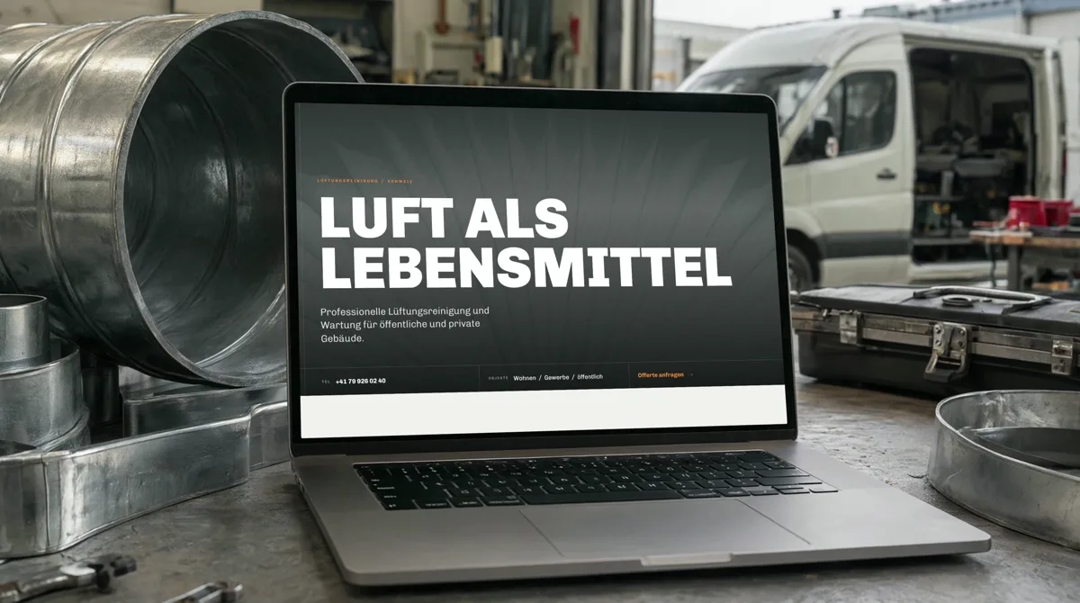
A ventilation cleaner has a problem that other tradespeople do not have: their best work cannot be seen. It lies in ducts behind the ceiling and in a fan wheel in the plant room. What people see is the van outside the house. For CR Lüftungen in Bülach the identity therefore starts on the street, and even before the first line with a question no mood board answers: which van is it exactly? Under the designation L2H1, the Ford Transit Custom comes in two generations, the newer one with 200 millimetres more wheelbase, and vinyl forgives no mistakes. The vehicle registration document settles it, and the lettering takes shape at a scale of 1:25 on a template of exactly this van.
The signet, drawn like a fan wheel, spreads across the rear sides and wraps round the corner at the back, as if the parked van were still moving air. On the rear sits a QR code for everyone waiting behind it at the lights, and on the roof a large one for everyone looking down, from a balcony, an office, a building site on the third floor. The website, "Air as a necessity of life", then finally shows what happens behind the grille: a slider overlays two real photos of the same duct, before with a furry coat of dust, after clean all the way down.
Precision you can see
Kinetra sells something you cannot put in a box: the production rights to the finest Swiss measuring technology, instruments developed over decades under the name Microtest. The market belongs to names like Zeiss, Hexagon and Mitutoyo, and the site has to read as well for engineers as for executives without turning into a catalogue. So the home page is red, a single colour, an emblem of four interlocking diamonds and one sentence. The Microtest System appears as an exploded view with seven numbered parts, from the ratchet to the probe, and every page ends with the same honest list, suitability for series production, sample unit, CAD and drawings, each with a tick or a cross. Every path leads to a conversation rather than a basket: "Book an appointment" accompanies every view.
In the first person
A one-person workshop wins its customers through trust and word of mouth, not through discounts and showrooms. The site of DD Moto in Gontenschwil is therefore written in the first person, on first-name terms and free of industry clichés, and opens with an attitude instead of an offer: "A life without a motorcycle is possible. But pointless." Right next to it sits the WhatsApp button, because a form does not suit someone who works in the workshop himself. Under the same roof, his father's MD Garage has looked after Ferraris, Lamborghinis and classic cars for more than two decades, and its site picks up the tone of the shop floor: heavy type on a paper-toned background, photos numbered as in an archive, a stamp reading "Officina MD, dal 2000".
Both sites have an admin area that only does what is needed. Texts sit side by side in German and English, line by line, edited fields can be reset to the original with one click, and the whole content can be backed up as a single file. No workshop planning, no invoices, no parts management: a tool nobody uses only costs maintenance.
Show, don't tell
For an agency whose work is this visually powerful, the site has to take a back seat. The site of Next Hype opens with a face made of light and a single sentence and arranges the work in three reels, Commercial, Lifestyle and Entertainment. The showreel switches between landscape and portrait, because brands see it on the wall in a pitch as much as in the feed on their phone, and at the end there is no contact page but a wall full of brands with one red button: "join". For the collective Team Black Cat, the site takes an even further step back: the latest works are shown large and uncropped, every member has a profile with artist name and discipline, and the collective sets the order, not an algorithm.
Goosebumps with a timetable
A horror event thrives on atmosphere, but people book it on hard facts, and Basement of Horror in Zofingen delivers both on the same screen. At the top runs a warning tape with the age limit, the date and "Enter at your own risk", behind the title scenes from the arena flicker, and right below are the four facts every group is looking for. The event is presented as a case file, restricted zone B-9, a missing doctor. Three buttons lead to the tickets and all point to the same destination, so a change only needs to be made in one place, and every application to join the cast is saved first and only then sent: if email delivery ever fails, it is still there.
Sites that no longer need their agency
Orbit's Jan Stalder was previously responsible at Geyst AG for websites for clients who have to prove every day that they live up to their promises. For Flow Swiss, one of Switzerland's leading cloud providers, the promise "committed to simplicity" is already there in the navigation, and a new product is a new block, not a new website. WEMF, whose studies are the currency of the advertising market for press and cinema, wanted an in-house team that can publish without waiting for an agency for every line; for this, among other things, a module is built for price lists that change year after year. At AssetImmo, the investment foundation for Swiss pension funds, the figures come first, each with its reference date, and since 2021 the grid has held up through every half-year report and, in 2025, even the foundation's move, without a single relaunch.
This has become a principle that applies to every Orbit web presence: the owner updates it themselves. A website that no longer needs its agency sounds like a strange goal. For a business that wants to grow, it is the only right one.
Delivered as designed
In the industry, a lot gets lost between design and finished website, and every deviation costs a round of feedback. At Orbit a design is not rebuilt but handed over: from Figma or directly from Parallax, it becomes foundation, building block and page in Relay, and a rendering browser compares, container by container, whether the surface follows the design. A brand's colours, typefaces and icons stay its own: one client's typefaces never end up with another.
At Orbit, a web presence is not an end point but the beginning of a tool: the same building blocks later carry the portal, the app and the printed matter. That way a business still looks like itself in five years, even after it has grown. Anyone looking for a web presence like this will find the people who design it, build it and keep working with it in Fahrweid near Zürich.